The Moment Coin Design Became Neutral

Estimated reading time: 10–12 minutes
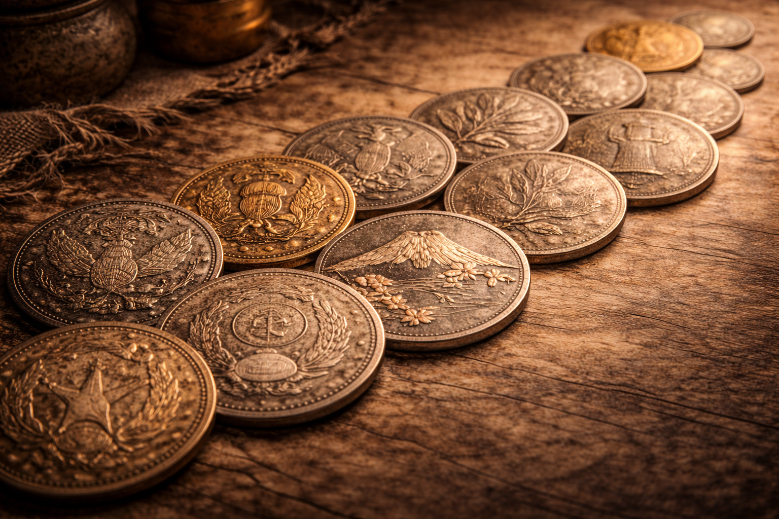
If you put a handful of older coins on a table, you can almost feel the confidence in them. The designs look like they want to be noticed. Portraits, bold emblems, sharp national statements, even the way the lettering sits on the surface feels like it was meant to project authority.
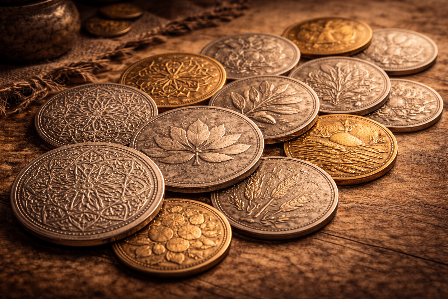
Then you look at many modern coins and something feels different. They don’t demand attention in the same way. They still represent a country, but the message is softer. More calm. More shared. Sometimes it feels like the design is trying not to start an argument.
That quiet shift is one of the most interesting turning points in coin design history. Not because it’s dramatic, but because it’s so practical. Somewhere along the way, a lot of coins stopped taking sides and started choosing symbols that almost anyone could accept.
Neutral design doesn’t mean the coin became empty. It means the coin became carefully safe. And that alone tells you something important about the world that created it.
Table of Contents
When Coins Stopped Taking Sides
For centuries, coins were confident storytellers. They showed rulers, crowns, coats of arms, military symbolism, ideological messages, and national pride that felt loud enough to hear. That wasn’t accidental. In many eras, a coin wasn’t only money. It was a portable announcement of who controlled the system.
But modern life changed the environment coins live in. Societies became more diverse. Politics became more public. People started disagreeing openly, and disagreement became part of daily life. In that kind of world, strong symbols can feel like a daily confrontation.
That’s when “neutrality” begins to look like a design solution. Instead of a coin that constantly reminds you of leadership and ideology, you get a coin that feels like shared space. It still represents the nation, but it does it with symbols that don’t provoke the same emotional reaction.
A plant doesn’t feel like propaganda. A landmark doesn’t feel like a political speech. A simple emblem can be national without being personal. Neutral design is the coin saying, quietly, that it wants to work for everyone.
And the moment a nation begins designing coins that way, it reveals something about its priorities. It isn’t always idealism. Often it’s just realism. People need money that doesn’t divide them.
Why Neutrality Started to Matter
Neutrality becomes important when a society reaches a certain level of complexity. When there are more voices, more opinions, more cultures, more public debate, a coin that feels “too personal” can become uncomfortable.
A portrait can invite judgment. An ideological symbol can invite tension. Even a slogan can feel like a side is being chosen. Neutral design avoids that.
It also protects the currency from constant redesign. If coins are tied to a leader, every leadership change becomes a design problem. If coins are tied to calmer shared symbols, they can remain stable even when politics shift. Stability is a currency’s best friend.
Another reason neutrality started to matter is fatigue. Modern societies deal with a lot of noise. People are surrounded by headlines, debates, strong opinions, campaigns, and controversy. In that environment, everyday objects that feel calm become comforting. Money is one of the most repeated objects in life, so the calmness matters more than people admit.
There’s also a subtle psychological idea here. Coins exist at a strange intersection between the public and the personal. A coin is issued by the state, but it lives in your pocket. If the design feels aggressive, the state feels closer than you want. If the design feels neutral, the state feels quieter, and daily life feels more yours.
That’s why neutrality isn’t a random design trend. It’s a response to the modern relationship between citizens and power. A coin becomes a small sign of how a country wants to be felt in everyday life.
You can almost read this transition like a mood shift. The coin is still official, still formal, still controlled, but it stops trying to dominate the eye. It starts to sit peacefully in daily life.
From Strong Symbols to Quiet Designs
Strong symbols don’t disappear because they lose meaning. They often disappear because they have too much meaning. The more a symbol carries ideology, the more it risks dividing people. Neutral design is a way to keep identity without turning identity into a fight.
This is why many neutral designs have a certain shared pattern. They focus on things that feel broadly acceptable:
- nature symbols that suggest the land itself
- architectural landmarks that suggest permanence
- abstract geometry that suggests modernity without ideology
- simple emblems that suggest continuity without personality
- cultural motifs that feel heritage-based rather than political
It’s not that these symbols are “neutral” in the sense of being meaningless. They’re neutral in the sense of being less likely to trigger immediate conflict. They express belonging without forcing agreement about leadership.
Quiet designs also reflect something else: a stronger confidence in institutions. When a system is stable, it doesn’t always need to shout. It can whisper. A coin can be simple because the system behind it feels secure enough to not prove itself constantly.
Another detail you notice in many quiet modern coins is balance. The design often looks like it wants to be pleasant. Not impressive, not intimidating, just pleasant. That aesthetic choice feels small until you realize how different it is from the era when coins were built to project strength.
There’s also a technical reason this trend spreads. Modern minting can produce extremely clean lines and subtle textures that older technology couldn’t always deliver. That makes minimalist design more viable and more satisfying. A simplified design today can still look rich because the surfaces can be precise and intentional.
So the shift toward quiet designs is partly cultural, partly political, and partly technical. But the outcome is the same: coins become easier to live with.
Neutral Does Not Mean Empty
Sometimes people hear “neutral coin design” and imagine a blank coin with nothing to say. That’s not what happens. Neutral designs are often full of meaning, just delivered in a calmer tone.
A plant on a coin can be a long story about land, climate, local pride, and heritage. A landmark can be a story about memory, achievement, and belonging. A simple emblem can carry centuries of identity without being tied to a living person.
The difference is that neutral meaning feels shared. It doesn’t demand loyalty to a leader or an ideology. It offers something most people can accept without feeling forced.
This is why neutral design can actually be more inclusive than strong design. It makes room for different citizens to feel represented without declaring that only one narrative is correct.
You can even see neutral design as an honest admission. It says the country knows its people don’t all agree on everything, so it chooses symbols that can sit in everyone’s pocket without feeling like a daily debate.
Neutral design is often a sign that a society values everyday peace more than daily declarations.
Another hidden strength of neutral design is longevity. A strong symbol might feel dated after a few decades if politics shifts. A calmer symbol can last longer, because it’s tied to broader identity rather than a temporary mood.
That’s why neutral designs can become timeless. They don’t try to capture a single moment. They try to create a stable everyday feeling that survives multiple moments.
How Neutral Coins Changed Everyday Money
Once coin design becomes neutral, something changes in how money feels. People stop noticing it as much, and that’s not an insult. It’s a kind of success. The coin becomes frictionless.
When designs are calmer, the coin becomes less of a daily political object. It becomes more like a tool. A shared tool. That changes the emotional relationship people have with currency.
It also changes what a nation chooses to highlight. If the coin isn’t about leadership, it becomes about place. About culture. About small shared pride. About the country as a home rather than a hierarchy.
That shift can affect national storytelling in a quiet way. People grow up seeing plants, landmarks, and symbols as the “face” of their money. Over time, those images become normal, and leadership becomes less central in the visual identity of everyday life.
Another practical outcome is that neutral coins age well. Even when the political climate changes, the coin design doesn’t suddenly feel awkward. It doesn’t instantly become a reminder of a specific era. It stays usable, emotionally and visually.
That may sound like a small advantage, but across decades it matters. The most successful everyday designs are the ones that don’t become embarrassing later. Neutrality helps with that.
Neutral design also makes coins more internationally readable. When a tourist holds a coin with a plant or a landmark, it feels welcoming. When a tourist holds a coin with aggressive ideology, it can feel strange. Countries that care about international image sometimes prefer neutral symbolism for that reason too.
So neutrality changes money in three ways: it reduces tension, increases longevity, and makes identity feel shared.
What Neutral Design Says About Modern Society
If coin design is a mirror, neutral design reflects a society that wants calmness in everyday life. It reflects a society where disagreement exists, and the system tries to keep daily tools stable.
It can also reflect a society that is tired. Not in a negative way, but in a realistic way. Modern citizens face constant messages, constant campaigns, constant opinions. A coin that whispers instead of shouting can be a relief.
Neutral design can reflect institutional confidence too. When a country believes its identity is stable enough, it doesn’t need dramatic imagery to prove itself. It can choose clean symbols and let consistency do the work.
At the same time, neutrality can reveal caution. Sometimes a country chooses neutral design because it wants to avoid controversy. It wants symbols that won’t upset anyone, even if that means avoiding deeper cultural arguments.
But even that tells you something true. It tells you the nation is aware of its own complexity and wants to keep everyday objects from becoming battlegrounds.
In that sense, neutral coins are not “boring.” They’re honest. They admit that the best design for everyday money is often the one that doesn’t pick a fight.
When neutrality becomes a design goal, it usually means the society values shared comfort more than loud symbolism.
And once you start looking at modern coins through that lens, you realize neutrality is not the absence of meaning. It’s meaning delivered in a tone people can live with.
That’s why this turning point matters. It shows how the visual language of power softened. It shows how daily life demanded less confrontation and more stability. And it shows how a coin, of all things, became a small tool for keeping society calm.
Final Reflection
The moment coin design became neutral wasn’t a single day on a calendar. It was a slow adjustment, like a room gradually lowering the volume. But the change is real, and it’s visible once you know where to look.
Older coins often wanted to be noticed. Modern coins often want to be accepted. And that difference tells you more about modern society than most people expect.
If you hold a neutral coin today, you’re holding a quiet agreement. An agreement that everyday money should be shared space. A tool that works for everyone. A design that doesn’t demand loyalty, only trust.


