When American Coins Stopped Looking Old

Estimated reading time: 10–12 minutes
At some point, many American coins stopped feeling old. Not suddenly. Not officially. But gradually, almost quietly.
There was no announcement that said American coin design had entered a modern era. Yet when you compare older coins with what came later, the shift becomes impossible to ignore. The visual language changed.
This change was not about abandoning tradition. It was about adapting everyday money to a world that was moving faster and thinking differently.
The interesting part is that most people lived through this transition without ever noticing it. Coins simply began to feel more natural in the hand.
Table of Contents
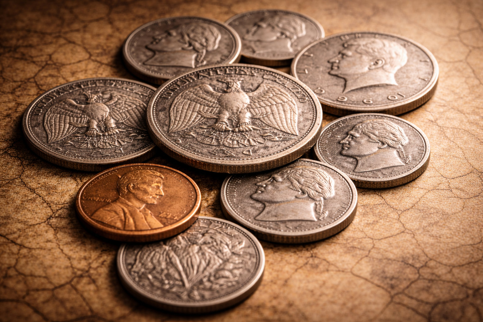
When Old Designs Started Feeling Outdated
Older American coins were not poorly designed. They were designed for a different pace of life.
Heavy engraving, dense symbolism, and formal layouts once communicated authority and seriousness. Those qualities mattered in earlier eras.
But as daily life accelerated, those same qualities began to feel visually heavy. Coins were no longer ceremonial objects. They were tools for constant movement.
This is where design pressure began to build. Money needed to work faster than it used to.
What Made American Coins Look Old
A design starts to feel old when its visual language no longer matches the rhythm of daily life.
Many earlier American coin designs relied on:
- dense engraving that required close inspection
- formal portrait styles rooted in earlier traditions
- tight layouts with little visual breathing room
- decorative details that aged poorly with wear
None of these elements were mistakes. They simply belonged to another time.
As coins circulated more aggressively and wore down faster, clarity began to matter more than decoration. What once felt dignified began to feel cluttered.
The Shift Toward Modern Visual Language
The shift did not happen overnight. Designers began simplifying gradually.
Layouts opened up. Lines became cleaner. Visual hierarchy became clearer.
This same practical logic later shaped other major design changes in American coin history, including the transformation explored in this deeper look at the design shift that reshaped American coins .
The goal was not modernity for its own sake. The goal was usability.

Simplicity as a Modern Signal
Simplicity often signals confidence.
A system that trusts itself does not need heavy decoration to prove legitimacy. It allows clarity to speak instead.
Simpler coin designs stayed readable as they aged. They survived wear without losing identity.
That durability mattered. Coins needed to last in circulation, not just look impressive on release.
How Americans Adapted Without Noticing
One of the most interesting aspects of this shift is how unnoticed it was.
Americans did not protest new designs. They did not need explanations.
The designs worked. And when design works, people accept it instinctively.
Familiarity rebuilt itself quickly. The coins blended into daily routines without friction.
The New Identity of Everyday Coins
Modern American coins reflect a new identity. One built on clarity, trust, and repetition.
They no longer try to look ceremonial. They try to belong.
This identity aligns closely with American daily life. Fast paced. Practical. Reliable.
Coins stopped looking old when they started behaving like everyday tools instead of visual statements.
Final Reflection
American coins did not become modern through a single redesign. They modernized through a shift in priorities.
Clarity replaced decoration. Familiarity replaced ceremony. Trust replaced visual weight.
And that quiet transformation is why many American coins no longer feel old at all.
Frequently Asked Questions
Why did American coin designs become simpler over time?
Simpler designs improved clarity, durability, and recognition. As coins circulated more frequently, usability became more important than decoration.
Did people notice when American coins changed design?
Most changes happened gradually. Because the designs worked smoothly, people adapted without paying much attention.
Do modern coin designs mean less symbolism?
Not necessarily. Modern designs often carry meaning through balance and familiarity rather than heavy decoration.
Why do older coin designs feel outdated today?
Older designs were created for slower daily rhythms. As life accelerated, clarity and simplicity became more important.


