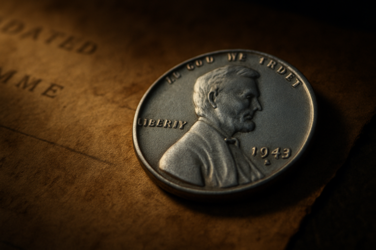
Why Some American Coins Feel Different

Estimated reading time: 10–12 minutes
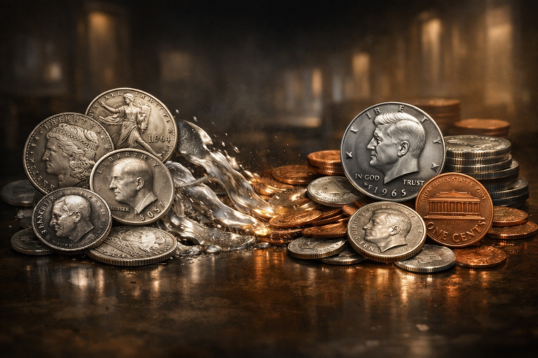
Some American coins feel different the moment you touch them. Not in a dramatic way, not in a way that makes you stop your day, but in a small, quiet way that your brain notices before you do.
They feel familiar even when they are old. They feel practical even when they are beautifully made. They feel like they were designed to live in pockets, not in display cases.
If you’ve ever handled coins from multiple countries, you may have felt it without being able to explain it. Some coins feel like tiny medals. Others feel like small pieces of everyday infrastructure. American coins often sit in that second category. They have a certain directness. A certain calmness. A certain confidence that doesn’t need to impress you.
That “feel” did not happen by accident. It came from design decisions made over time decisions shaped by daily life, by mass circulation, by public recognition, and by a deep preference for money that works smoothly without demanding attention.
Table of Contents
The First Feeling in Your Hand
A coin is one of the few design objects you don’t choose. You inherit it from the system. You don’t pick the shape. You don’t pick the texture. You don’t pick the symbols. It enters your day anyway, and your brain instantly decides whether it feels “normal.”
That first feeling is not just about metal. It’s about recognition. It’s about whether your eyes can read the coin quickly. It’s about whether the layout feels balanced. It’s about whether the symbols feel familiar enough to trust.
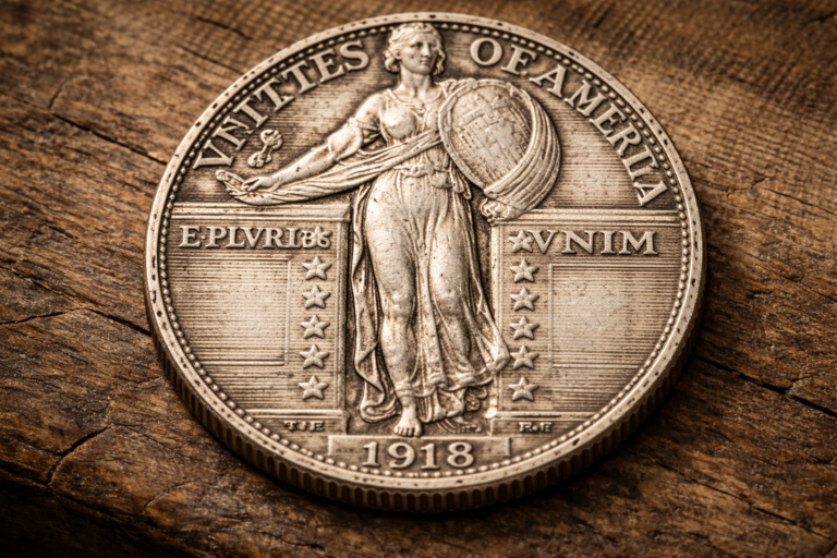
American coins often create a fast sense of recognition. Even if you don’t study coins, the designs feel anchored. The portraits tend to be straightforward. The layout tends to be stable. The overall style often feels like it belongs to routine, not ceremony.
That is a very American design instinct in general. Many everyday objects in American life are built to be functional first. The “feel” of American coins grew from that same mindset. Money was meant to move.
And when something is meant to move, design has to make it easy.
Why American Coins Never Tried to Impress
This part can sound strange at first. Because of course American coins have strong imagery. They have recognizable figures. They have national symbols. They carry identity.
But many American coin designs don’t chase decoration for decoration’s sake. They don’t overload the surface with complex storytelling. They tend to avoid the feeling of a “medal.” Instead, they focus on being instantly readable and easy to accept.
That approach fits a nation built around scale. Large circulation. Many people. Many transactions. In that environment, money has to be reliable first and beautiful second.
There’s also something cultural behind it. American daily life tends to value directness. People prefer things that work and don’t slow them down. When a coin design feels direct, it becomes invisible in the best way. You don’t fight it. You just use it.
And that invisible comfort becomes “familiar,” which is one of the strongest emotional qualities money can have.

Once you see this, you notice that a lot of American coin design is about calm consistency. The designs are not trying to surprise you. They are trying to become part of your day without friction.
And when a design becomes part of your day, it becomes part of your memory. That is where trust begins.
Design Built for Speed and Trust
Trust is a strange thing. People assume trust in money comes from law, institutions, and economics. That is all true. But everyday trust also comes from simple recognition.
If your brain can identify a coin quickly, you feel safer accepting it. If your brain hesitates, you feel friction. That friction is small, but it matters. A design that reduces hesitation becomes a design people prefer.
American coin design has long leaned into fast recognition:
- stable layout that rarely feels chaotic
- clear central imagery that anchors the eye
- symbols that people can recognize without studying
- consistent visual language across coin types
The goal is not to entertain. The goal is to keep exchange smooth. When exchange is smooth, daily life feels smoother. And people rarely notice how much they depend on that.
Another part of trust is honesty in design. A coin that looks too ornamental can sometimes feel like it’s trying too hard. A coin that looks calm and direct can feel more honest. That’s a psychological reaction, not a logical one, but daily life is built on psychological reactions.
Over time, this creates a “design trust.” Even without thinking, people accept the coin because it feels like it belongs. That sense of belonging is what makes certain American coins feel different.
Familiar Shapes Americans Grew Up With
Familiarity is not only in symbols. It’s also in shape, weight, and texture. People form muscle memory with coins. They recognize them by feel as much as by sight.
Coins that circulate heavily become part of everyday habits. People learn the size differences without measuring. They learn the edges without looking. They learn the weight without thinking.
That physical familiarity creates emotional comfort. And comfort creates trust.
This is why changes in coin design are often handled carefully. Even a small shift can disrupt routine. When a design feels too new, people notice. And when people notice, they hesitate.
American coin design has often respected that reality. Even when designs changed, they tended to keep a sense of continuity. The coin may evolve, but it rarely tries to break the relationship people have with daily money.
That continuity is one reason American coins feel familiar. They carry the feeling of long-term routine, passed down through everyday life.
When Simplicity Became an Advantage
In many countries, simplicity can be mistaken for lack of artistry. But in coin design, simplicity can be powerful. Simple designs are easier to recognize. Easier to reproduce at scale. Easier to keep consistent over time.
Simplicity also ages well. A design that is too tied to one era can feel outdated quickly. A design that is clean and balanced can stay acceptable across decades.
This is where American coins often stand out. Their design language can feel straightforward, even when the details are carefully crafted. They don’t rely on heavy ornament to prove legitimacy. They rely on stability.
That’s not a small point. When a system trusts its own stability, it does not have to shout. It can stay calm.

Simplicity is also practical in a very basic way. Coins get worn. They get scratched. They get dirty. They circulate for years. A simple design remains readable even when it loses sharpness.
That’s part of the “feel” too. A coin that stays readable as it ages feels dependable. A coin that becomes confusing when worn can feel less trustworthy, even if the value never changes.
So simplicity is not only aesthetic. It’s functional durability. And durability is one of the strongest emotional signals money can carry.
A coin can feel trustworthy when it looks like it was designed to survive daily life, not to impress a collector.
How Design Reflects American Daily Life
Coins don’t just reflect art. They reflect how a society moves. And American life, especially in its everyday rhythms, tends to be fast, practical, and built around routine.
Money in that environment needs to do a simple job well. It needs to be easy to handle, easy to recognize, easy to accept, and stable enough to become invisible.
That is why American coins can feel different. They don’t always feel ceremonial. They feel like they belong to daily life. Like they were designed to be touched a million times without causing friction.
There’s also a cultural comfort in repeated national imagery. When people grow up seeing the same visual language on money, it becomes part of identity. Not identity as a slogan, but identity as routine.
And routine identity is powerful, because it feels natural. You don’t need to be told what to believe. You absorb the feeling through daily repetition.
This is where coin design becomes a quiet form of social design. It shapes how people feel about the system, not through speeches, but through daily objects.
A coin that feels familiar can make the system feel familiar. A coin that feels calm can make the system feel calmer. That connection is subtle, but it exists.
The difference people feel in American coins is often the result of design choices that prioritize routine, recognition, and quiet trust.
In other words, the “feel” is not magic. It’s design meeting daily life. And when design meets daily life successfully, it becomes part of how a country feels, one small coin at a time.
Final Reflection
Some American coins feel different because they were built to belong to routine. They were shaped by the need for fast recognition and smooth circulation. They learned to communicate trust quietly, through balance, clarity, and familiarity.
The next time you hold a coin, notice the first feeling in your hand. Before you analyze the symbols, ask yourself whether the coin feels calm, direct, familiar, or distant. That reaction is real, and it comes from design choices made long before you ever touched the coin.
And once you start noticing that, you may never look at everyday money the same way again.
