Why America Chose Wheat for the Penny
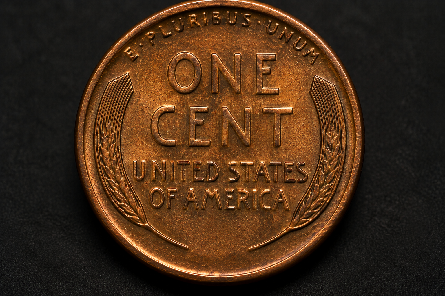
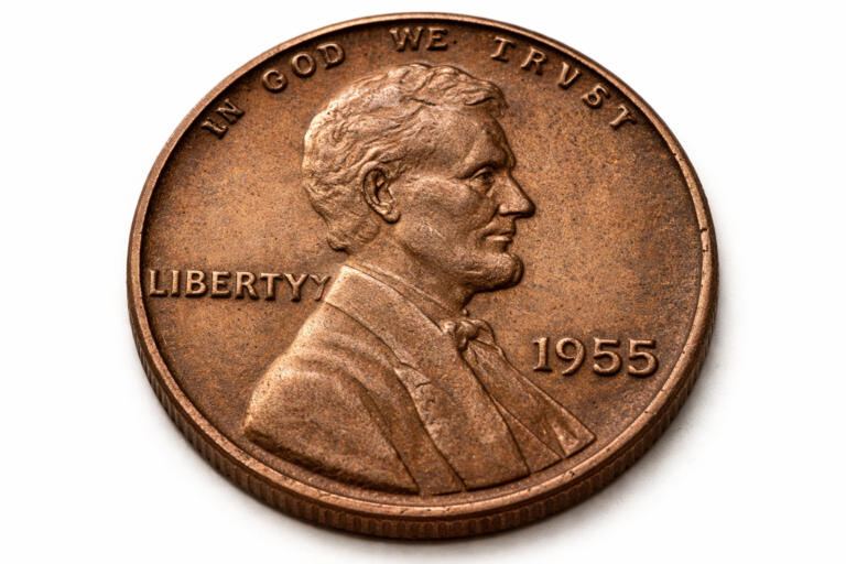
Abraham Lincoln dominates the front of the 1909 cent. Turn the coin over, however, and there is no eagle, no portrait, no famous building, and no complicated patriotic scene. Instead, two simple wheat stalks curve around the words ONE CENT and UNITED STATES OF AMERICA.
That simple reverse became so recognizable that collectors eventually stopped needing to say “Lincoln cent with the wheat reverse.” They simply called it the Wheat Penny. But why was wheat chosen in the first place? The answer involves Abraham Lincoln’s 100th birthday, sculptor Victor David Brenner, a carefully simplified reverse, and a design that proved far more enduring than anyone in 1909 could have known.
Quick Context
The Lincoln cent was introduced in 1909 to commemorate the 100th anniversary of Abraham Lincoln’s birth. Victor David Brenner designed Lincoln’s portrait for the obverse and two stylized wheat stalks for the reverse. The wheat design remained on regular Lincoln cents through 1958 before being replaced by the Lincoln Memorial in 1959.
Table of Contents
- What Was on the Penny Before Wheat?
- The New Penny Was Really About Lincoln
- Why Victor David Brenner Mattered
- So Why Did Brenner Use Wheat?
- Did the Wheat Symbolize Prosperity?
- Why the Simple Reverse Worked So Well
- Brenner Defended the Wheat Design Himself
- The Tiny Detail Between the Wheat Stalks
- How Wheat Became the Coin’s Identity
- Why the Wheat Finally Disappeared
- Reality Check
- Related Stories
- Final Verdict
- Frequently Asked Questions
What Was on the Penny Before Wheat?
Before Lincoln appeared on the cent, Americans were familiar with the Indian Head cent. That design had been used since 1859 and remained in production into 1909.
The arrival of the Lincoln cent therefore represented much more than changing the decoration on the back of a coin. It introduced an entirely new visual identity for one of America’s most frequently handled denominations.
Most importantly, Lincoln’s appearance marked a major departure in American circulating coinage. The new cent honored a real historical figure, Abraham Lincoln, rather than relying on the traditional allegorical representation of Liberty that had dominated earlier American coin designs.
The timing was deliberate. Lincoln had been born in 1809, making 1909 the centennial of his birth.
The New Penny Was Really About Lincoln
This point is important because the name “Wheat Penny” can make the reverse seem like the main reason the coin existed.
It wasn’t.
The central historical event behind the new cent was Lincoln’s 100th birthday. Wheat was part of the design Brenner created for that new Lincoln coin.
That means the 1909 cent should not be understood as an agricultural commemorative coin. Its primary subject was Lincoln. The wheat stalks provided the reverse design for a coin whose obverse carried one of the most recognizable portraits ever placed on American money.
The combination proved remarkably effective: a powerful historical portrait on one side and an uncluttered symbolic design on the other.
Why Victor David Brenner Mattered
Victor David Brenner was a sculptor, engraver, and medalist whose work on Lincoln attracted attention before the cent appeared.
His portrait of Lincoln developed from earlier medallic work and ultimately became the basis of the cent’s obverse. Lincoln faces right in Brenner’s composition, a detail we explore more closely in why Lincoln faces right on the penny.
But Brenner was responsible for more than the famous portrait. He also created the original reverse.
Rather than competing with Lincoln’s portrait by placing another complicated image on the back, Brenner developed a much simpler arrangement based around two stylized wheat stalks.
Those stalks became one of the longest-lived reverse designs in American circulating coinage.
So Why Did Brenner Use Wheat?
Look closely at the reverse and the artistic logic becomes easier to understand.
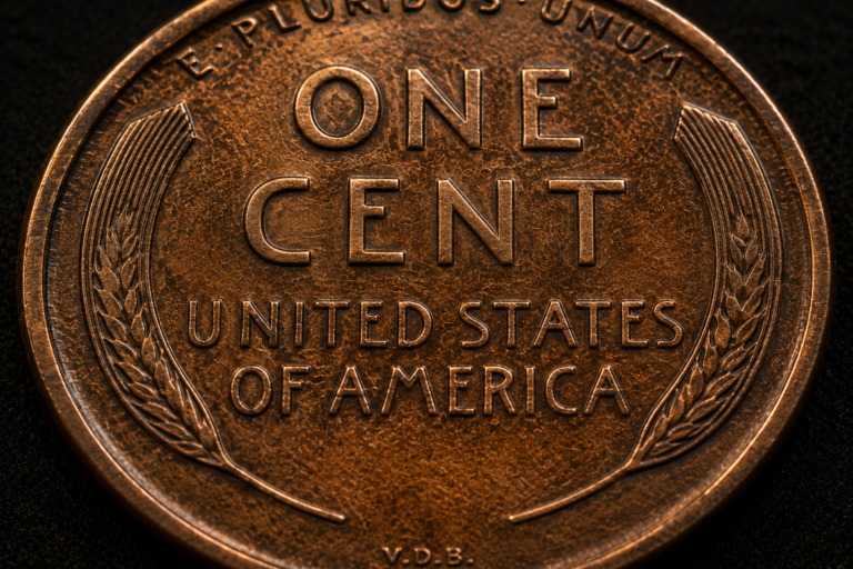
The wheat does not occupy the center of the coin. Instead, one stalk rises along each side, creating a natural frame around the inscriptions.
ONE CENT sits prominently in the center. UNITED STATES OF AMERICA appears below it, while E PLURIBUS UNUM curves across the upper portion of the reverse.
The wheat gives the otherwise text-heavy side of the coin a visual structure.
Without those stalks, the reverse would largely consist of lettering. With them, the eye is guided inward toward the denomination while the composition remains balanced from left to right.
The design also worked at the extremely small scale required for a cent. Brenner did not attempt to reproduce a realistic agricultural landscape. He reduced the wheat into stylized forms suitable for coinage.
Did the Wheat Symbolize Prosperity?
This is where a useful distinction should be made between historical evidence and later interpretation.
Numismatic references commonly associate Brenner’s wheat stalks with national prosperity. The connection makes sense. Wheat is a basic agricultural crop, and imagery involving grain has a long visual association with abundance, harvest, fertility, and prosperity.
For the United States of the early twentieth century, agricultural imagery would also have been immediately recognizable.
But collectors should be cautious about turning a reasonable symbolic interpretation into an undocumented quotation from the designer.
There is a difference between saying that the wheat can represent prosperity and claiming that Brenner left a specific hidden message explaining exactly what every stalk meant.
The strongest evidence tells us that the wheat was a deliberate artistic choice. Brenner himself later discussed how carefully he had worked on its stylization. That is more reliable than inventing a secret meaning that the historical record does not clearly establish.
Why the Simple Reverse Worked So Well
The Wheat Penny reverse contains very few elements, but each one has a clear job.
| Reverse Element | Role in the Design |
|---|---|
| Two stylized wheat stalks | Frame the central inscriptions and create the reverse’s main visual identity |
| ONE CENT | States the denomination prominently in the center |
| UNITED STATES OF AMERICA | Identifies the issuing nation |
| E PLURIBUS UNUM | Places the traditional national motto above the central composition |
| V.D.B. on early 1909 cents | Identifies designer Victor David Brenner |
There is very little wasted space.
The stalks occupy the outer areas of the reverse, the denomination dominates the middle, and the lettering fits naturally into the remaining space. The result is symmetrical without feeling mechanical.
This simplicity also made the coin easy to recognize. Even on circulated examples where smaller details have worn away, the basic shape of the two wheat stalks remains obvious.
Brenner Defended the Wheat Design Himself
One of the most revealing pieces of evidence comes from Brenner himself.
After controversy erupted over the size and placement of his V.D.B. initials on the first 1909 cents, Brenner wrote to prominent numismatist Farran Zerbe and defended his work.
In discussing the reverse, Brenner explained that the stylization of the wheat had been done with considerable thought. He believed the design worked particularly well with the required wording on the cent.
That statement tells us something important. The wheat was not simply filler placed around ONE CENT because an empty space remained.
Brenner had considered how the stalks should be simplified and how they would interact with the inscriptions required on the coin.
This also helps explain why the reverse feels so cohesive. Its simplicity was intentional.
The Tiny Detail Between the Wheat Stalks
The original 1909 design contained one additional detail that quickly became famous.
At the bottom of the reverse, between the bases of the two wheat stalks, Brenner placed his initials: V.D.B.
Their prominence generated criticism shortly after the new cent entered circulation, and the initials were removed from the reverse during 1909. They eventually returned in much smaller form on the obverse in 1918, beneath Lincoln’s shoulder.
That tiny space became one of the most closely examined areas on any Lincoln cent, especially because of the famous 1909-S VDB issue.
We examine the initials separately in the story of Brenner’s VDB initials and the detail originally hidden between the wheat stalks.
How Wheat Became the Coin’s Identity
When the first Lincoln cents appeared in 1909, nobody could know exactly how strongly those two wheat stalks would become associated with the coin.
The reverse remained in production through 1958, a fifty-year span that covered extraordinary changes in American life.
The Wheat Penny passed through World War I, the economic turmoil of the Great Depression, World War II, and the enormous industrial expansion that followed.
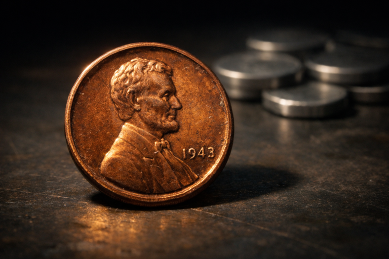
Even the coin’s metal did not remain completely unchanged. The most dramatic example came in 1943, when wartime demand for copper led the Mint to produce zinc-coated steel cents for circulation.
Yet the familiar wheat reverse remained.
That continuity helped turn the design into something larger than decoration. Generations of Americans saw those wheat stalks in pocket change, cash registers, jars, and rolls of cents.
Today, a collector can often recognize a Wheat Penny from the reverse before even checking the date.
That longevity sets up another important part of the story: how the Wheat Penny survived two world wars while keeping its basic visual identity.
Why the Wheat Finally Disappeared
The wheat reverse did not disappear because the design had failed.
Its replacement came with another Lincoln anniversary.
The original Lincoln cent had arrived in 1909 for the 100th anniversary of his birth. Fifty years later, 1959 marked Lincoln’s 150th birthday.
For that occasion, the reverse was redesigned. Frank Gasparro’s Lincoln Memorial replaced Brenner’s wheat stalks, while Brenner’s Lincoln portrait remained on the obverse.
As explained in why Wheat Pennies changed forever in 1959, the transition created a fascinating combination: the original 1909 portrait survived while the reverse entered an entirely new era.
The Wheat Penny had finally ended, but the Lincoln cent continued.
Reality Check
The Lincoln Wheat Penny was not introduced as an agricultural commemorative coin. The main historical purpose of the new 1909 cent was to honor the 100th anniversary of Abraham Lincoln’s birth.
Wheat was Victor David Brenner’s reverse motif. Its association with prosperity and abundance is reasonable and well established in numismatic interpretation, but collectors should avoid presenting elaborate “secret meanings” as documented statements from Brenner unless historical evidence supports them.
What we can say confidently is that Brenner deliberately stylized the wheat and believed it worked effectively with the required inscriptions. Its role was both symbolic and artistic.
Final Verdict
America’s Wheat Penny began with Lincoln, not with agriculture. The new cent was introduced in 1909 to commemorate the 100th anniversary of Abraham Lincoln’s birth, and Victor David Brenner needed a reverse that could complement his powerful portrait without overwhelming a very small coin.
Two stylized wheat stalks provided the solution. They framed the denomination, balanced the required inscriptions, and carried a natural association with prosperity and abundance. Brenner himself made clear that the stylization of the wheat was carefully considered.
The real surprise is how long that simple choice lasted.
For fifty years, through enormous economic, political, and technological change, Americans continued turning over Lincoln cents and seeing the same two wheat stalks. By the time the design disappeared in 1959, wheat was no longer merely part of the reverse.
It had become the identity of an entire generation of Lincoln cents.
Frequently Asked Questions
Why was wheat put on the Lincoln Penny?
Victor David Brenner used two stylized wheat stalks to frame the inscriptions on the reverse of the new 1909 Lincoln cent. Wheat has long been associated with abundance and prosperity, while the stalks also provided a simple and balanced artistic structure for the reverse.
Was the Wheat Penny created to honor American farmers?
The primary historical purpose of the 1909 Lincoln cent was to commemorate the 100th anniversary of Abraham Lincoln’s birth. The wheat was part of Brenner’s reverse design, rather than the coin being created specifically as an agricultural commemorative issue.
Did Victor David Brenner say the wheat represented prosperity?
Brenner discussed the care he took in stylizing the wheat and defended the artistic effectiveness of the reverse. Prosperity is a widely accepted interpretation of the wheat motif, but it should not be presented as a direct quotation from Brenner unless supported by a specific historical source.
Who designed the Lincoln Wheat Penny?
Victor David Brenner designed the original 1909 Lincoln cent. His work included the famous right-facing portrait of Abraham Lincoln on the obverse and the two stylized wheat stalks on the reverse.
What is written between the wheat stalks?
The reverse centers ONE CENT and UNITED STATES OF AMERICA between the wheat stalks, with E PLURIBUS UNUM above. On the earliest 1909 VDB cents, Brenner’s V.D.B. initials also appeared at the bottom between the bases of the stalks.
How long did the Wheat Penny design last?
The Wheat Ears reverse was used on regular Lincoln cents from 1909 through 1958. In 1959, it was replaced by Frank Gasparro’s Lincoln Memorial design for the 150th anniversary of Lincoln’s birth.
Why did the Wheat Penny design last so long?
Its simple composition was recognizable, practical, and closely associated with the Lincoln cent. Although American coinage and the country itself changed dramatically during those fifty years, the basic Wheat Ears reverse remained in use until the Lincoln anniversary redesign of 1959.
Are the wheat stalks actually wheat ears or wheat sheaves?
Numismatic references use several descriptions, including wheat stalks, wheat ears, and sheaves of wheat. Visually, the reverse consists of two stylized wheat elements rising along the left and right sides of the inscriptions rather than large tied bundles of harvested grain.